


| What We Learned from Participants | |
|---|---|
| Impressive Style - Select "6" Design | |
 |
|
Notes:
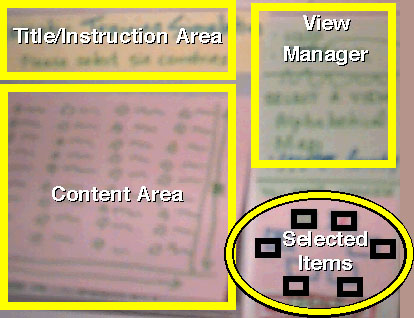
In the first design exercise, we asked the groups to design a method for selecting six countries from all the countries in the world. One of the nicest stylistic components of one of the designs was the "Selected Items" area on the bottom right of the interface. It was designed to look like a round table where the selected countrie's participants would gather to discuss trade tariffs (part of the original scenario). As each country was selected a flag of that country and the countries name would appear at each seat. Thus, the design not only conveyed a "United Nations" like style by using the flags, it represented how many countries were selected, how many needed to be selected, and even (although not part of the requirements) showed how the UN delegate would sit at the table. Arranging guests at a table is a big deal for international engagements and is reflected in this design. In addition, the releationship between the "Content Area," where all the countries are visible (in text or graphic format) and the "Selected Items" is easy to see. |
Slide 25 of 32
Comments: Happily Received!
Home Pages: Miller's & Rettig's
Page: https://design.softcom.com/workshops/w6_report/slide_25.html
Updated: 01.20.1998