Improve UI Performance and Smoothness
Work
|
The web application went through many iterations with the team and with feedback
from our internal customers, and now included informal feedback from customers. Functionality Issues: Distributed Server Management Usability Issues: Improve navigation and organization of nested functions. Necessity Issues: Server Restart, Virtual Clustering of Servers
|
|
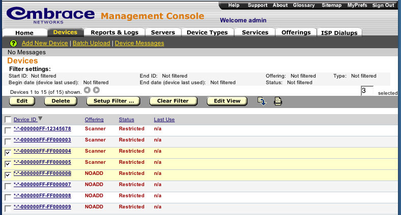
This page shows one of the basic list pages. This shows Devices, which are the bread
and butter of the system. Columns are sortable. Columns, and custom columns can be added
and removed from this view. Navigation to any page in the system is now one click away (each main menu has a pop-below submenu).
The user always knows what page they are on with multiple cues. Filtering and sorting information is always shown.
|
|
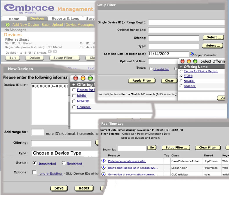
In these few pieces of screen shots, you can see the visual consistency. The style guide at work for button naming and locations, and the
consistent use of the select object. This object was used in place of the previous pop-down
menu so that 100's or even 1000's of items could be easily listed. The pop-down menu is in appropriate for such long lists, and is
incorrectly used by many web designs. A consistent theme in this application is to be more consistent
with traditional desktop applications. Thus, whereas on a PC application a checkbox or radio button label is clickable, it is here as well.
No more hunting for the checkbox. One can click anywhere on a label to check the item. This was something that the HTML specs have overlooked.
|
|