I have three problem areas that I would like to address and some specific
problems from other areas:
(1) Navigating complex sites
(2) E-commerce interfaces
(3) Selections and feedback
(1) As for navigating complex sites, I see problems when I want to display both first
and second (and often third) layer navigation on the same page.
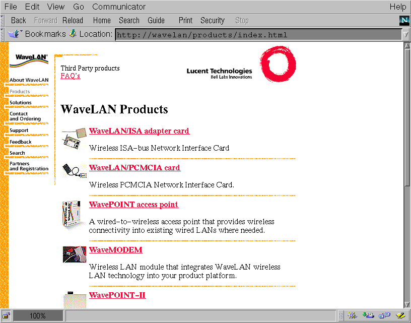
My example where this problem arises is a site we are currently building for WaveLAN
(a Lucent Technologies subsidiairy). See the attached images "wavelan1.gif" and
"wavelan2.gif" for a preview of the site and its' navigation.
On the left side is the first level navigation. The WaveLAN-logo is the "home"
button, the other titles are the main sections of the site. The second level
navigation is on top of the page in the center (the names of subsections will be
images instead of the HTML that you see now).
In the example ("wavelan1.gif") the main section "Products" was chosen, so this line
is greyed out in the first level navigation. It is still clickable to allow a return
to the section's "homepage". The heading confirms the coice ("WaveLAN Products") and
a list of product-titles, descriptions, and small images is shown. The second level
navigation (top-center) tells you that besides the product listing there are other
subsections called "Third Party Products" and "FAQ".
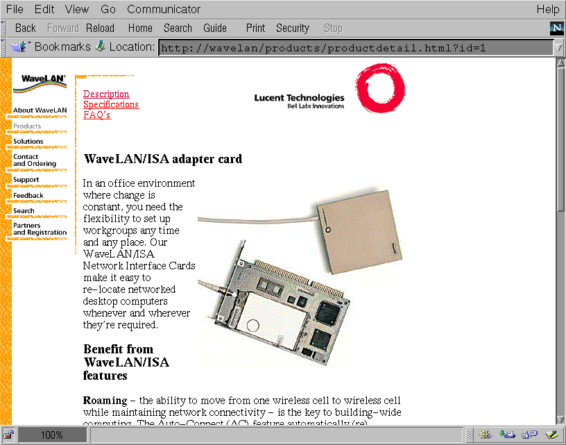
Selecting a product from the list leads to a page ("wavelan2.gif") with more product
information and a larger image. We want this page to have third level navigation
elements to pages called "specification" and "(product specific) FAQ". These two
pages should have similar 3rd level navigational elements ("description" and "FAQ",
or "description" and "specification" respectively).
What should we do with the second level navigation? Keep it there (top-center) and
expand it with these 3rd level stuff? Or put the 3rd level navigational elements on
another elsewhere (under the heading?). What if there is the need for 4th level
navigation?
Suppose there is a link from a page to another page that happens to be displaying an
element from a list. On tha page a link "back to list" might be functional if you
came from the list, but if you came from another page, it's confusing. Is re-wording
the link enough? Should these links only be created if you come from the list? What
if you don't? A simple JavaScript back-button might create a loop if the list is also
part of a list...
(2) E-commerce interfaces have some specific features that call for design decisions
that are not always trivial.
An e-commerce application typically consists of a catalog of products, a
basket/shoppinglist, and order-confirmation pages dealing with payment and shipping
details.
One design decision that needs to be made is whether to display the (new)
shoppinglist each time a visitor adds a product to his/her basket or not.
Another is how to deal with visitors leaving before they order: Should their baskets
be kept for future use? How do you identify a previous basket if there are more than
one? How do you warn a visitor that his/her basket is lost if they leave? Is
registering every visitor a solution?
(3) Selections and feedback
When placing interactive elements on HTML-pages (feedback forms, drop-down-boxes,
database selection forms, etc) there's a problem with feedback.
What if the visitor has to make a choice in two dimensions (e.g. color and size)?
Suppose you put the two choices on one page and afterwards just one of the choices
must be changed. What if making a choice takes up lots of screen space, e.g. picking
a (small) country on a worldmap?
If a vistor forgets to supply data for a required field, do you display the same page
with an error? Where is the error-message placed? (at the top of the page, near the
field, or both?) Or do you display the error-message on a separate page with a
self-defined back-button? Do you put other navigational elements on that error-page?
How do you allow visitors to select two elements from the same dimension (two colors,
two sizes, two countries)? Checkboxes? Repeat the choice? Multiple select? What if
the dimension is graphical as with the countries? How do you "undo" a selection?
(4) Some miscellaneous other problems:
- In a search-engine interface where visitors can supply tow search terms, how can
they indicate both which boolean logic operator to use (AND/OR) and wether a search
term is optional or required for the search? (e.g. AltaVista allows you to use '+' for
required fields and assumes that a space between search terms means "AND")
- In what order do you walk through articles in a discussion group? What is the
function of a next and previous button? Do you loop through topics breadth-first
(topic by topic) or depth-first (all articles from a topic)? Are up- and down-buttons
usefull?